
 Facebook
 X
X
 Pinterest
 Copy Link
Thinking of selling your home in Burlington, Camden, or Gloucester Counties, New Jersey? You’ve probably heard all about curb appeal, decluttering, and staging. But there’s another powerful tool in your selling arsenal that’s often overlooked: the color of your walls! The right paint color can transform a room, making it feel more spacious, inviting, and ultimately, more appealing to potential buyers.
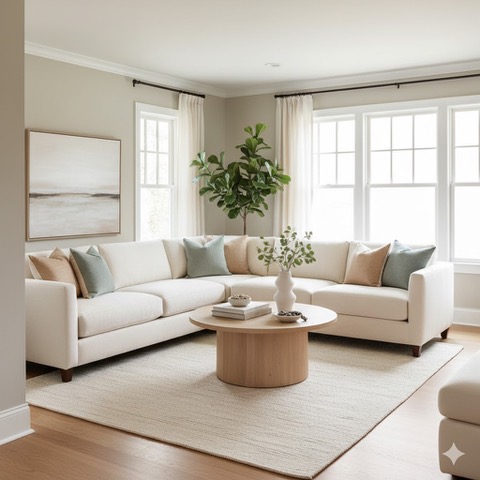
Transform your living room into a serene oasis that buyers will love! This inviting space, painted in a light greige, showcases how neutral tones create an airy, spacious feel, helping potential buyers envision themselves at home in Burlington, Camden, or Gloucester County, NJ.”
At Weister Stambaugh Team from Coldwell Banker Realty, we’ve seen firsthand how a fresh coat of paint can make a significant difference in securing a higher offer and a faster closing. While personal taste is always essential, when it comes to selling, it’s wise to lean into calming, neutral tones that allow buyers to envision themselves and their belongings in the space. These colors create a serene backdrop, making your living room feel like a peaceful retreat—a central selling point for any New Jersey home sale.
Here are eight calming colors that consistently top the charts for increasing home sale appeal and helping homeowners in South Jersey get top dollar:
- Warm Off-White (e.g., Benjamin Moore’s “Swiss Coffee” or Sherwin-Williams’ “Alabaster”) An undeniable classic! Warm off-whites are bright and airy without feeling sterile. They reflect light beautifully, making rooms feel larger, and provide a versatile canvas for any decor style.
- Light Greige (e.g., Benjamin Moore’s “Revere Pewter” or Sherwin-Williams’ “Agreeable Gray”) The perfect blend of gray and beige, greige offers sophistication and warmth. It’s incredibly versatile and works well with both warm and cool-toned furnishings, making it a safe and stylish bet.
- Soft Gray (e.g., Sherwin-Williams’ “Light French Gray” or Farrow & Ball’s “Pavilion Gray”) A subtle, sophisticated gray can make a living room feel modern and chic. Opt for grays with warm undertones to avoid a cold or institutional feel. This color pairs wonderfully with natural wood and crisp white trim.
- Pale Blue (e.g., Benjamin Moore’s “Palladian Blue” or Sherwin-Williams’ “Sea Salt”) A very pale blue can evoke feelings of peace and tranquility, making a living room feel like a calming oasis. It’s particularly effective in homes near water or with a coastal vibe, but it offers a sense of serenity.
- Muted Sage Green (e.g., Benjamin Moore’s “Saybrook Sage” or Sherwin-Williams’ “Clary Sage”) Connecting us with nature, a muted sage green brings a touch of organic calm indoors. It’s sophisticated yet inviting, and pairs beautifully with natural textures and earthy tones.
- Soft Beige (e.g., Sherwin-Williams’ “Accessible Beige” or Benjamin Moore’s “Manchester Tan”) For those who prefer a warmer neutral, a soft, creamy beige is always a winner. It creates a cozy, inviting atmosphere without being overpowering, making buyers feel instantly at home.
- Dusty Lavender (e.g., Sherwin-Williams’ “Evening Shadow” or Farrow & Ball’s “Calamine” in a very diluted version). While a bit more adventurous than other neutrals, a very subtle, dusty lavender can offer a unique touch of warmth and elegance. It’s sophisticated and calming, creating a gentle, welcoming glow.
- Creamy Yellow (e.g., Benjamin Moore’s “Acadia White” or Sherwin-Williams’ “Dover White” with a hint of yellow). A touch of creamy yellow can make a room feel sunny and cheerful without being too vibrant. It’s a subtle way to add warmth and a welcoming glow, especially in rooms that don’t get much natural light.
Why These Colors Work for South Jersey Real Estate
- Broad Appeal: Neutrals and soft hues appeal to a wider range of tastes, making it easier for buyers to envision their own furniture and style in the space.
- Create Space: Lighter colors reflect light, making rooms feel larger and more open—a huge plus for buyers.
- Enhance Natural Light: These colors amplify natural light, making your home feel brighter and more inviting.
- Project Calm: A calm and serene environment helps buyers feel relaxed and comfortable, encouraging them to linger longer and connect emotionally with your home.
So, whether you are planning to sell your home in Burlington County, Gloucester County, or Camden County, before you grab your paintbrushes, remember to test swatches on your walls to see how the colors look in different lighting conditions throughout the day.
And, for personalized advice on preparing your home for a successful sale, including strategic painting and staging tips specific to the South Jersey real estate market, don’t hesitate to contact the Weister Stambaugh Team from Coldwell Banker Realty at (609) 605-4306! We’re here to help you make your home shine and achieve your goals for your Camden County, Burlington County, or Gloucester County home sale.


